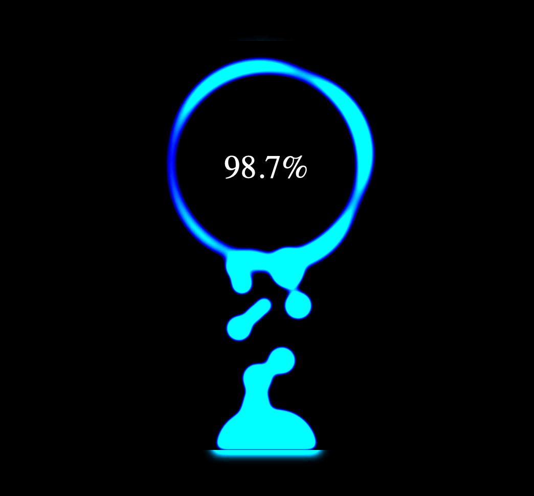
通过css,我们可以实现很多动画效果,例如,我们通过animation,transform,filter,这些动画相关的css属性,就可以模拟手机充电的动画效果:
html结构如下:
<div class="g-container">
    <div class="g-number">98.7%</div>
    <div class="g-contrast">
        <div class="g-circle"></div>
        <ul class="g-bubbles">
            <li></li>
            <li></li>
            <li></li>
            <li></li>
            <li></li>
            <li></li>
            <li></li>
            <li></li>
            <li></li>
            <li></li>
            <li></li>
            <li></li>
            <li></li>
            <li></li>
            <li></li>
        </ul>
    </div>
</div>
CSS代码如下:
html,
body {
    width: 100%;
    height: 100%;
    display: flex;
    background: #000;
    overflow: hidden;
}

.g-number {
    position: absolute;
    width: 300px;
    top: 27%;
    text-align: center;
    font-size: 32px;
    z-index: 10;
    color: #fff;
}

.g-container {
    position: relative;
    width: 300px;
    height: 400px;
    margin: auto;
}

.g-contrast {
    filter: contrast(10) hue-rotate(0);
    width: 300px;
    height: 400px;
    background-color: #000;
    overflow: hidden;
    animation: hueRotate 10s infinite linear;
}

.g-circle {
    position: relative;
    width: 300px;
    height: 300px;
    box-sizing: border-box;
    filter: blur(8px);

    &::after {
        content: "";
        position: absolute;
        top: 40%;
        left: 50%;
        transform: translate(-50%, -50%) rotate(0);
        width: 200px;
        height: 200px;
        background-color: #00ff6f;
        border-radius: 42% 38% 62% 49% / 45%;
        animation: rotate 10s infinite linear;
    }

    &::before {
        content: "";
        position: absolute;
        width: 176px;
        height: 176px;
        top: 40%;
        left: 50%;
        transform: translate(-50%, -50%);
        border-radius: 50%;
        background-color: #000;
        z-index: 10;
    }
}

.g-bubbles {
    position: absolute;
    left: 50%;
    bottom: 0;
    width: 100px;
    height: 40px;
    transform: translate(-50%, 0);
    border-radius: 100px 100px 0 0;
    background-color: #00ff6f;
    filter: blur(5px);
}

li {
    position: absolute;
    border-radius: 50%;
    background: #00ff6f;
}

@for $i from 0 through 15 {
    li:nth-child(#{$i}) {
        $width: 15 + random(15) + px;
        left: 15 + random(70) + px;
        top: 50%;
        transform: translate(-50%, -50%);
        width: $width;
        height: $width;
        animation: moveToTop #{random(6) + 3}s ease-in-out -#{random(5000)/1000}s infinite;
    }
}

@keyframes rotate {
    50% {
        border-radius: 45% / 42% 38% 58% 49%;
    }
    100% {
        transform: translate(-50%, -50%) rotate(720deg);
    }
}

@keyframes moveToTop {
    90% {
        opacity: 1;
    }
    100% {
        opacity: .1;
        transform: translate(-50%, -180px);
    }
}

@keyframes hueRotate {
    100% {
        filter: contrast(15) hue-rotate(360deg);
    }
}
这里结构其实很简单,主要实现是通过css的animation,transform,filter属性控制元素,模拟动态效果。
-
css详解系列:10-Flex项目属性orderorder 属性 用来设置或检索弹性盒模型对象的项目(子元素)在容器中出现的順序。
-
css详解系列:11-Flex项目属性align-selfalign-self属性定义flex子项单独在侧轴(纵轴)方向上的对齐方式。
-
css实现点击切换图片效果的方法在css中我们可以使用伪类选择器来实现点击切换图片的效果,看看如何实现的。
-
css样式表的三种样式css(级联样式表)主要有三种样式定义方式
-
如何在css中实现样式优先级在css中,样式优先级是由一系列规则决定的,这些规则决定了当多个样式规则应用于同一个HTML元素时,哪个规则会优先生效。
-
css文本超出显示3个点的方法在css中,如果你想让超出特定长度的文本显示为三个点(...),你可以使用text-overflow属性,配合overflow和white-space属性。


暂无评论,抢个沙发...